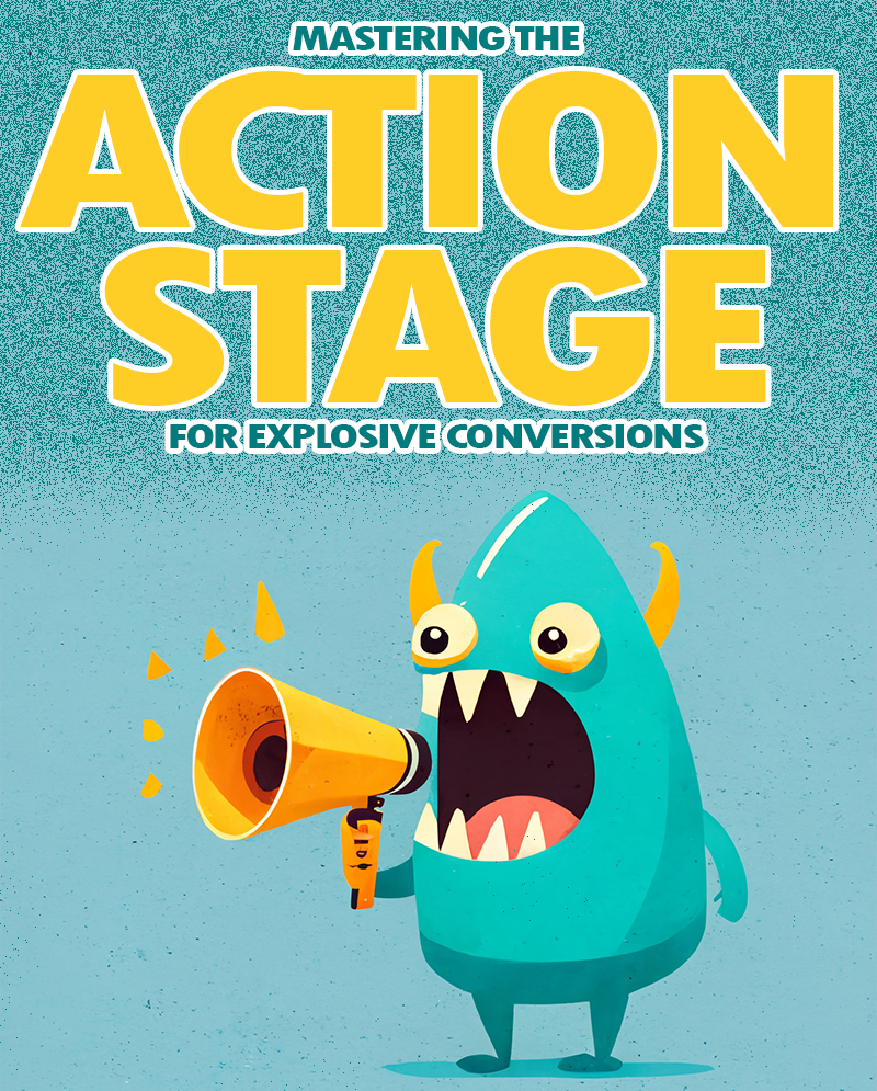
The Art of Persuasion: Mastering the Action Stage for Explosive Conversions
The Art and Science of the Call to Action
In the vast landscape of online business, the conversion funnel stands as a crucial pathway. At the action stage’s heart lies the often underestimated yet incredibly powerful Call to Action (CTA). Whether you run a service-based business or an e-commerce one, the perfect CTA is the linchpin that propels customers from visitors to clients.
Decoding the Essence of a Call to Action
At the core of any successful website lies the Call to Action. It’s a concise yet compelling prompt that propels visitors to take a desired action. Picture it as the director’s cue in a play, guiding the audience through the plot (the conversion process). The secret to a perfect CTA is in its ability to resonate with your audience. It’s ability to speak to their needs and desires.
Your website is a stage, and your CTA is the spotlight that directs attention to the main act – the conversion. Use active verbs and language that resonates with your audience. Instead of a generic “Click Here,” opt for a more engaging “Unlock Exclusive Deals” or “Start Your Journey Now.” The key is to evoke a sense of urgency and relevance, compelling your visitors to act in the moment.

The Psychology Behind the Action Stage
Humans are inherently wired to respond to certain triggers. A well-crafted CTA taps into these psychological nuances.
Consider incorporating the power of the first person. Instead of a detached “Get Your Free Trial,” invite your audience with a more personal touch like “Start My Free Trial.” This subtle shift makes the experience individualized. It creates a sense of ownership and connection.
Rhetorical questions can be another potent psychological tool. “Ready to Transform Your Business?” not only poses a question but also sparks contemplation. Additionally, employing positive language in your CTA instills confidence. Swap out “Don’t Miss Out” for a more optimistic “Seize the Opportunity.”
Designing the Irresistible CTA
Just as an artist carefully selects their palette, your CTA’s visual design plays a pivotal role in its effectiveness. The perfect Call to Action integrates with your website’s design while commanding attention.
Brevity is your ally here. A cluttered CTA can overwhelm and drive away potential conversions. Opt for clean, concise design that aligns with your brand’s aesthetic. Contrast is another crucial element. Make your CTA button stand out by using complementary colors to the scheme. The goal is to create a visual hierarchy that guides your visitors’ eyes to the CTA.
Consider the placement of your CTA as well. Above the fold is a classic choice, ensuring that your prompt is one of the first things your visitors see. However, don’t underestimate the power of strategic placement within your content. A well-timed CTA, seamlessly woven into your narrative, can have a profound impact.
Action Stage A/B Testing and Continuous Refinement
Crafting the perfect Call to Action is not a one-size-fits-all endeavor. A/B testing is your ally in optimization. Experiment with different phrasings, colors, and placements to discern what resonates most with your audience.
Think of A/B testing as a refining process. For the best conversion optimization, monitor user engagement, conversion rates, and bounce rates to gain insights into what elements of your CTA are working and what might need tweaking.
Your Call to Action, Your Conversion Symphony
In the symphony of online business, your Call to Action plays the role of the conductor, guiding each visitor through the intricate movements of the conversion funnel. Crafting the perfect CTA is an art informed by psychology, design, and continuous refinement.
As you embark on this journey, remember that the beauty of a well-crafted CTA lies not only in its ability to convert but also in its capacity to engage and resonate with your audience. Now, armed with the knowledge of language, psychology, and design, go forth and fine-tune your website’s conversion symphony.

Looking for Help?
Unleash the Power of Conversion! Elevate your business to new heights with The Monsters of Search. Our expert team is ready to transform your online presence and boost your conversion rates. Don’t let potential customers slip away—partner with us and watch your business thrive!